Das Entwerfen & wieder Entwerfen von Stilen 'das Entwerfen' ist im Wesentlichen der grundlegendste Bestandteil der technischen Analyse. Als solches würden einige behaupten, dass die roheren und grundlegenden auf einer Karte geplanten Daten dem technischen Händler wenig nützlich sind. Statt dessen könnten sie behaupten, dass ein technischer Händler fortgeschrittenere Hinweise und Mittel braucht um die Preisrichtung zu bestimmen. Hinweise wie bewegende Durchschnitte, Schwung-Hinweise, Oszillatoren und so weiter ., sie sind schließlich dem technischen Händler von großartigem Nutzen, aber nicht ohne erst die Grundlagen zu erlernen!
Line Charts Linienkarten dies sind nichts grundlegenderes als eine Skala/Linienkarte. Eine einfache Sehdarstellung von Daten, die Linienkarte plant den Schlusskurs eines einzelnen Tages und informiert über den Kurs von Wochen und Monate verbindet die Punkte. Unten zeigt ein Beispiel eine grundlegende Skala/Linienkarte:
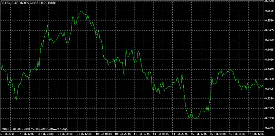
Das Skalen-Liniendiagramm wird häufig als stark gesehen. Oder so kann es auf anderen Märkten sein. Auf dem Forex Markt bietet die Skala/Liniendiagramm sehr wenig Scharfsinnigkeit bei der Flüchtigkeit des Marktes, oder der Bewegung innerhalb des Zeitrahmens eines einzelnen Tages an. Weil die meisten Forex Händler 'Tageshändler' sind (häufig in und aus Positionen in einer 24h Periode) ist eine Skala selbst wenn stündlich geplant noch viel zu wünschen übrig liesse. Wir werden andere Charting-Methoden erklären, die dem vorherigen Punkt mehr Sinn geben!
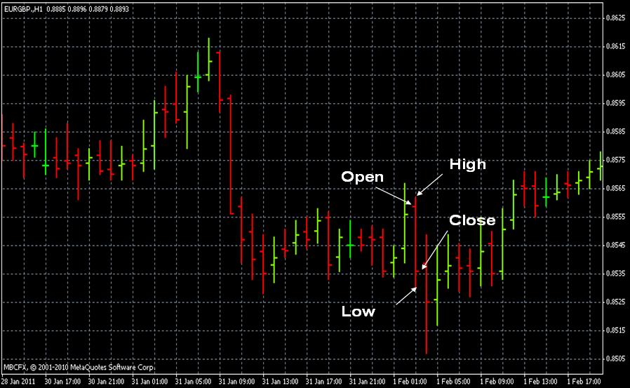
Bar Charts -Stabdiagramme sind hauptsächlich die weniger visuell ansprechende Version von Candlestick charts /Kerzenständer-Karten. Candlestick charts Kerzenständer-Karten sind heute die populärste bei Forex Händlern verwendete Methode. Jedoch könnte es wichtig sein, das eine und das anderen zu verstehen. Ein Stab-Balkendiagramm zeigt einen Preis offen, hoch, niedrig und den Schlusskurs. Wie gezeigt im Bild, die Spitze des Stabdiagramms vertritt den höchsten Preis der Periode, und die Unterseite zeigt den niedrigsten Preis der Periode. In der rechten und linken Seite der Bar das sind "ticks", der linke tick vertritt den offenen Preis der Periode, und die riechte tick vertritt den endgültigen Preis der Periode.
Candlestick Charts / Kerzenständer-Karten Wirklich die beste Wahl für heutige Forex Händler, die Kerzenständer-Karte bietet dieselbe Information wie ein Stabdiagramm, aber tut dies in einer viel asketischeren angenehmeren Weise. Wie in den zwei Bildern unter den Kerzenständer illustriert wird, besteht aus einem "body" und einem oberen und niedrigeren "wick". Der Körper der Kerze ist normalerweise in dunkler Farbe, wenn das Ende zu einem niedrigeren Preis war ist das offen (bearish candle). Umgekehrt, wenn der Schlusskurs bei einem höheren Preis als noch offen wird die Kerze eine helle Farbe haben (bullish candle) Der Docht-wick der Kerze vertritt die komplette Reihe des Preises für diese Periode. Die Spitze des Dochts vertritt natürlich den Preis bei seinem höchsten Punkt, während der Boden des Dochts den Preis bei seinem niedrigsten Punkt vertritt. Ein schneller flüchtiger Blick an einem Kerzenständer wird einem erfahrenen Auge wörtlich alles erzählen, was man über einen Preis innerhalb eines bestimmten Zeitrahmens wissen will, d. h. welcher der hohe und niedrige Preis war, war er bullish oder bearish, wo das Offen und nahe war. Ein Händler kann auch auf eine Reihe von Kerzen mit wenig Gedanken überblicken, wie viele Konsekutivkerzen bullish oder bearish gewesen sind; in Verbindung mit anderen technischer Analysen dient häufig als eine passende Timing-Methode um einen Handel einzugehen.

What am I Looking For? More often than not, traders in the Forex market doom their own technical analysis. The reason is simple; they look at a chart and try to remember everything that they have ever studied about technical analysis. Before long it seems that one philosophy only contradicts another, an obvious entry becomes a source of confusion and so on. Some of the best traders in world have a bit of a mental check list that is always considered when analyzing a chart. However, they also know that too many technical indicators used in conjunction with one another is a fast track to a certain demise.
There are certainly a few things that you are going to want to consider when looking at a chart. As the course continues you will be better prepared to compile your own trading style. For the time being, consider the following a check list for the novice. Ask yourself what the chart on your screen is telling you, and which of the following considerations are worth considering:
Is there an obvious trend or direction of the market within the time frame that you are viewing?
Are there any basic chart formations such as ascending or descending triangles, wedges, pennants, double tops or bottoms or otherwise that might suggest a pending breakout or trend reversal.
Is the market trading within the walls of any obvious support and resistance levels, or is the market trading within a channel?
Have you considered at least two technical indicators, i.e. two technical indicators that complement each other well?
Have you ignored the impulse to consider every technical indicator that you have ever read a paragraph or two on?
You should now understand at least the basics of what a technical trader is looking for when analyzing a chart and the market. As we continue to dissect various technical indicators and forms of pattern recognition your skills will be refined, for the time being it is enough to know, if nothing else, what it is that you will ultimately be looking for.
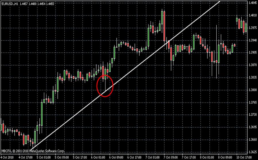
Support & Resistance Trends Fortunately for traders in the Forex market, dealing in this market is often about dealing in trends. It is often said that ‘the trend is your friend’; there is truth to this, but only when a trader understands why the market trends and the underlining factors that can often disassemble a forming trend (these factors will be covered throughout the course as we further analyze technical analysis).
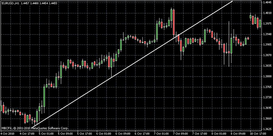
The image above shows an example of an upwards trend. Notice that the trend line was drawn by identifying the lowest low of the trend and connecting the line to the following low preceding a new high. A solid trend line should continue in this manner until at least four lows followed by new highs are plotted. This trend line can also be referred to as a support level. In other words, think of this line as if it were the roof of a house. During this trend period the price range is going to crawl along the roof of the house. In an upwards trend we are obviously looking for an opportunity to buy. It is generally taught that a trader’s best buy entry point during an upwards trend would be at the lowest low of the candle on the third touch of the support level, as shown below:
Just the opposite of an upwards trend, in a downwards trend our trend line can be referred to as a resistance level. Now as opposed to trading along the outside of a roof we are trading along the top of the ceiling. During this trend a trader can assume that the price is often going to reach the ceiling, but never push through it. A trader following a well developed downwards trend is looking for an opportunity to sell on the third touch of the resistance line at the highest possible point of the candle, as shown below:
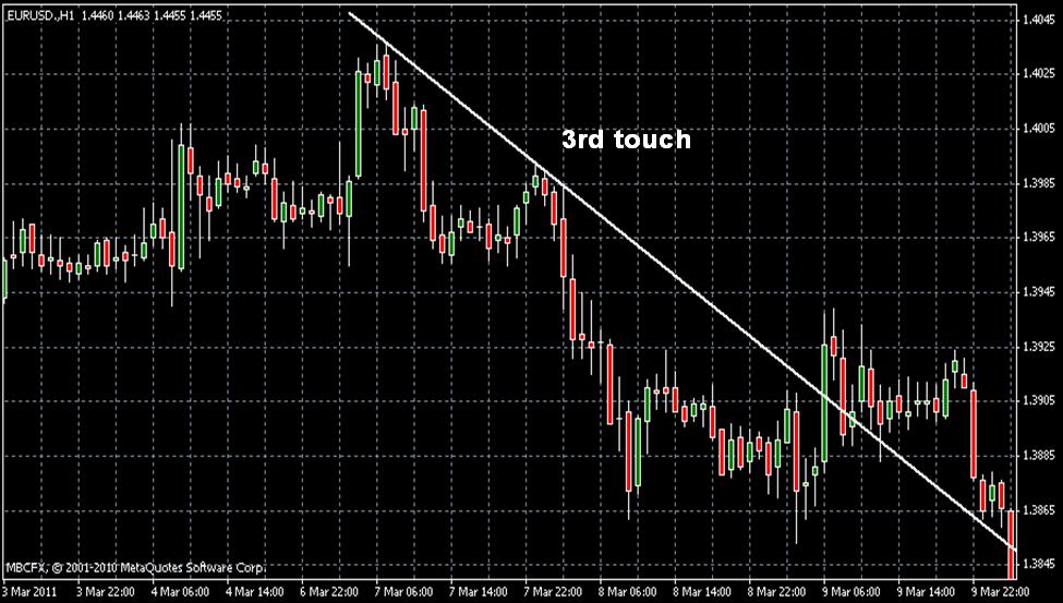
Timing an entry point within a trend is as key as recognizing a trend, as obviously they will not last forever. First consider the time frame of the chart that you are viewing in relation to the likely continuance of the trend. As mentioned earlier, we are usually looking to buy or sell on the third touch of a support or resistance level within a trend. Using historical data in your charts, you will notice that the average trend will not provide more than 3 to 4 additional touches of the support or resistance after the first 3 that would have inspired you to note the trend to begin with. Thus, depending upon whether you are viewing a 1 minute chart, a 5 minute chart, or so on you will need to gage an estimated time frame within which you will trade.

 عربي
عربي Spanish
 French
 Plolish
 Deutch
 中文(简单)
 中文(簡體)
 Russian